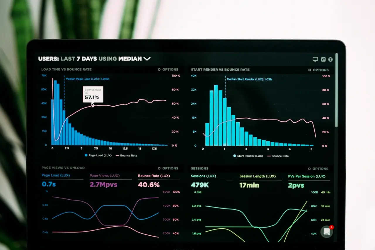

Mr. Marek runs a large moving company in London. He invested in Google Ads, generating huge traffic to his website. Every day, hundreds of people visited his site, but the phone remained silent. The conversion rate was a mere 0.5%. Mr. Marek was burning hundreds of pounds a day on clicks that brought no orders.
Desperate, he asked us for an audit. We quickly discovered that the problem was not a lack of demand for his services, nor poor ad quality. The problem was the website itself. It was a classic "leaky bucket" through which potential customers were escaping.
Many Polish companies in the UK make the same mistake. They focus on generating traffic, forgetting about User Experience (UX). Here are the 7 most common mistakes that stop your site from selling.
1. Lack of a Clear Call to Action (CTA)
A customer visits the site and reads about your company's history. What should they do next? If you don't tell them clearly, they will simply close the tab. Buttons like "Call for a Free Quote" or "Book an Appointment" must be large, contrasting, and visible at every stage of browsing the site.
2. Overly Complicated Contact Forms
Mr. Marek required customers to provide their first name, last name, e-mail address, phone number, exact moving address, date, and description of belongings. No one has time for that. We shortened the form to two fields: "Phone Number" and "Postcode". The number of inquiries increased by 400%.
3. Ignoring Mobile Users
Over 70% of internet traffic comes from smartphones. If your site requires zooming the text with fingers, and buttons are too small to hit, you lose the majority of customers. Professional websites in the UK must be designed with a Mobile-First approach.
4. Slow Loading Speed
Time is money. If a page takes longer than 3 seconds to load, half of the users leave. Image optimization, modern code, and fast hosting are the foundations without which even the best design will fail.
5. Lack of Social Proof
Customers don't trust ads. They trust other customers. The lack of genuine Google reviews, photos from completed projects, or logos of trusted partners makes your company seem anonymous and risky to work with.
6. Hiding Prices or Lack of Transparency
No one likes financial surprises. If you can't provide an exact price list, provide price ranges or clearly describe the quoting process. Hiding costs arouses suspicion and discourages contact.
7. Text Overload (Wall of Text)
People don't read websites - they scan them. Long, dense blocks of text are deterring. Use short paragraphs, bullet points, clear headings, and bold text to make it easy to quickly find the most important information.
Fix Your Leaky Bucket
After implementing UX improvements on Mr. Marek's website, the conversion rate jumped from 0.5% to 4.2%. With the same advertising budget, the company began acquiring eight times as many customers.
As a Polish advertising agency in the UK, we don't just create pretty graphics. We design sales funnels that turn visitors into loyal customers. Before you spend another pound on ads, make sure your site is ready to receive traffic. Contact us and order a professional UX audit of your website.